

NO MO’ BORING
I have one mission: no more boring graphic design
WARNING: This site contains graphic content. Viewer indiscretion advised.
Palm Springs is like crack for a graphic designer. Modernist architecture and mid-century colors (more about that later). Peacocking hipsters from LA and monotone macho Marines from the high desert. Palm tree exclamation points inverted against conveniently triangular mountains. Above it all, that hot comic book nuclear furnace blazing in an impossibly blue sky or a floodlight-moon whitewashing eeries arroyos .
So then, why the hell is most local graphic design so dull? I spend a lot of time looking at Palm Springs print and online media, tourism brochures and event programs, menus and real estate guides. Few of the graphics seem to synch with the unique vibrancy of our physical environment, the growing diversity of residents and visitors or the increasing wit and energy infusing our art scene.
So I am setting out to change that with fitzclick.com and I have but one mission: NO MO’ BORING.
CASE IN POINT
For example, take Palm Spring’s eponymous monocot. A zillion varieties of palms march gaily across our horizon like a chorus line of headresses from Mardi Gras. But when represented in print advertising (and how can you avoid it when every business seem to have palm, canyon, mountain, or sand lurking about in their name or tagline), our beloved icon is too often flattened into silhouette images against a silhouette mountain- a cartoon version of a tired Southwestern visual trope when the reality of it – the living and looming Mt. San Jacinto and ragged and silent canyons above the soaring canopies – deserves a lot more.
Returning to the boring-palm-puzzle, what would happen if you take took ubiquitous image and give it some visual oomph and energy, like one of those purple sunsets when the wind blasts down the mountainside and sheers the fronds off the palm trees, leaving downtown a foot deep in detritus?? Maybe, something like this.

Or this graphic of the palm trees during a summer heat wave.

SAVING ORANGE FROM ITSELF
The current craze for all things mid-century is making me crazy, literally making me a Mad Man. Oh sure, the design of the period can be fun and even brilliant, but when every other shop window on Palm Canyon bursts with orange, lime green, and turquoise tschotchkes, the thrill is definitely gone and you end up with the visual equivalent of the It’s a Small World theme song. Optical earwigs, to really mix my metaphors.
No doubt, the prevailing candy-colored palette is a big step up from the deadly beige, blue and rose of 1970’s desert chic but enough with the orange, already!
I am not advocating wholesale abandonment of the midcentury color canon since Palm Springs is its aesthetic epicenter, But, what about a visual “downshifting?” Just the addition of a little gray softens the color and make them less cliched. Take a look at some of the Homage to the Square paintings of 20th century color theorist Josef Albers. The same mid-century palette found here, but tonally deeper and more visually soothing and sophisticated. Putting my mouse where my mouth is (I know, another mixed metaphor), here is my example of downshifting.

WHAT MADE FITZ FINALLY CLICK?
Backstory: I spent an eternity in the world of corporate risk and finance, pretty much a creative wasteland. Even though I was affiliated with our marketing and communications team, there wasn’t much latitude to stray from the proscriptive confines of the corporate style guidelines and woe betide any apostacy. If you didn’t get the sharp rap on the knuckles from Herr Marketing Direktor, you got a salvo up the backside from the Kommandant of Kompliance.
After the ninth reorganization in as many years, I had had it. The day I hung up on my last conference call, I swore I was going to start my own graphic design practice. So, you could say that fitzclick began as a sort of prison break.

Like many career-switchers, I started small, creating graphics for friends and local non-profits in Sonoma County, 90 miles north of San Francisco. Full disclosure here: I did not go to school for graphic design. I am entirely self-taught although I have an art history background and certainly know communications well.
NATURE OR NUTURE
My love affair with graphic design started early. I vividly recall clandestinely cutting up my parents’ cherished National Geographic magazines. There was something about pasting a photo of Mad Ludwig’s Neuschwanstein on top of an Indian elephant’s back that made irresistible design sense to me. By eleven, I had created my first corporate logo using colored tape and affixing it to the side of my brother’s beater car to advertise his auto repair business. (My brother retired very comfortably at 50, but I hesitate to take full credit for his success.)
A brief and painful year in art school on a painting scholarship exposed my utter lack of talent and discipline as a painter. So, I did the next best thing and studied art history, specializing in the medieval and Renaissance period. That excellent education got me exactly where such training often does: sitting in a cubicle processing insurance claims. Fast forward through a dizzying career in insurance and then in risk consulting and we are back to the prison break.
WHAT CAN YOU EXPECT?
I love to work hard and I like to listen more than I like to talk, though you may not surmise that after you read my admittedly chatterbox blogs. I offer straightforward advice AFTER I listen and ask questions. Lastly, I love to have fun with my work since the world seems to forget that joy can exist in the most trivial endeavor or the tiniest moment. So, when I do work for a client, they can expect close listening, hard work, and honest and enjoyable collaboration. And exciting graphic design, of course.
My work is not for every organization or client. I focus primarily on non-profits since they are always cash-strapped and frequently struggle to design and execute an effective marketing plan. So, my rates are laughably cheap, but provide solid and professional results. Graphic design allows me to give back in a world that seems obsessed with taking.
WHAT’S IN A NAME?
About my business’s name. Fitz because that is my nickname. Click because that is the sound my camera shutter and my computer mouse makes. And maybe, because I hope I will click with reader of this blog.
I post blogs regularly so make sure to come on back.

ADDICTION
It all begins with an idea.
You suspect that you’re a visual addict when you can’t say no, can’t avert your glance, can’t turn off the HUNGER. You know you are an addict when, despite the visual fatigue and perceptual overload, there is still always more to be seen, more to take in or reject. ALWAYS, more.
I first realized this when I was quite young. My parents, struggling to make ends meet with a family of four kids, would rather desperately take us to the Cincinnati Art Museum every Sunday. The museum was free that day and there were sufficient other children to ensure that if our young attentions flagged – or more likely – our young bodies wandered, there would be some vigilant community mom to corral us back to safety and to not tip over a sculpture in a forbidden game of tag.
No tag for me, I had an addiction to cultivate.
THE FIX IS ON
I still remember my first fix: Edward Timothy Hurley’s Midnight Mass. It hung under the discreet lighting in the museum – a still scene in steel blues and muted violets with gray snow falling down on the barely-perceptible Church of the Immaculata which still stands modestly on a fist of slate, high above the Ohio River. The church was built just before the Civil War for the German congregation in the city’s Mt. Adams neighborhood. Immaculata, as it is still known, is a pilgrimage church. Each Lenten season, an increasingly dwindling number of the Catholic faithful make a painful climb up the hundreds of steps from the boulevard below to the church – on their knees. My intensely Irish Catholic father was one of those faithful until arthritis and the admonitions of his doctor curtailed his zeal.
But it was in winter that Immaculata and Mt. Adams becomes magical. Solid and stolid brick houses tumble down the slopes from the church – narrow, snow-clotted ribbons of crowded streets that mirrored those in Catholic Bavaria, the home of so many of Cincinnati’s immigrants. In the soft light and soothing tones of winter, it becomes a monotonal Cubist pastiche.

The almost photographic quality of the painting – and its romanticism – mesmerized me: it was the piece that I would rush to first on our endless subsequent visits to the museum. And decades later, I would render it as a graphic to be used on an abstract holiday card for my friends who still live in Cincinnati.

Bier Her, Bier Her, Oder Ich Fal Um.
Cincinnati also provided my first font fix, from Tony the Tiger’s Frosted Flakes and to Bordon’s milk cartons (my favorite breakfast reading) and eventually, to the ultimate Cincinnati product: BEER.
By the mid-1800’s, Cincinnati had 82 breweries and by 1890, it was dubbed the Beer Capital of the World. Even when I was a child (mind you, later than 1890), breweries hulked along either side of the Ohio River and the perpendicular Mill Creek with names that didn’t exactly trip off the tongue, unless you were one of those descendants of the original Cincinnati Germans. In the hot and humid summer, my parents would gather with friends in Biergartens with their kids. Bored with the oom-pah-pah music and beer-y adult conversation, I would pick the labels off of the empty beer bottles for my private stash. Long gone, these first mementoes of my graphic addiction can still be seen on the internet.
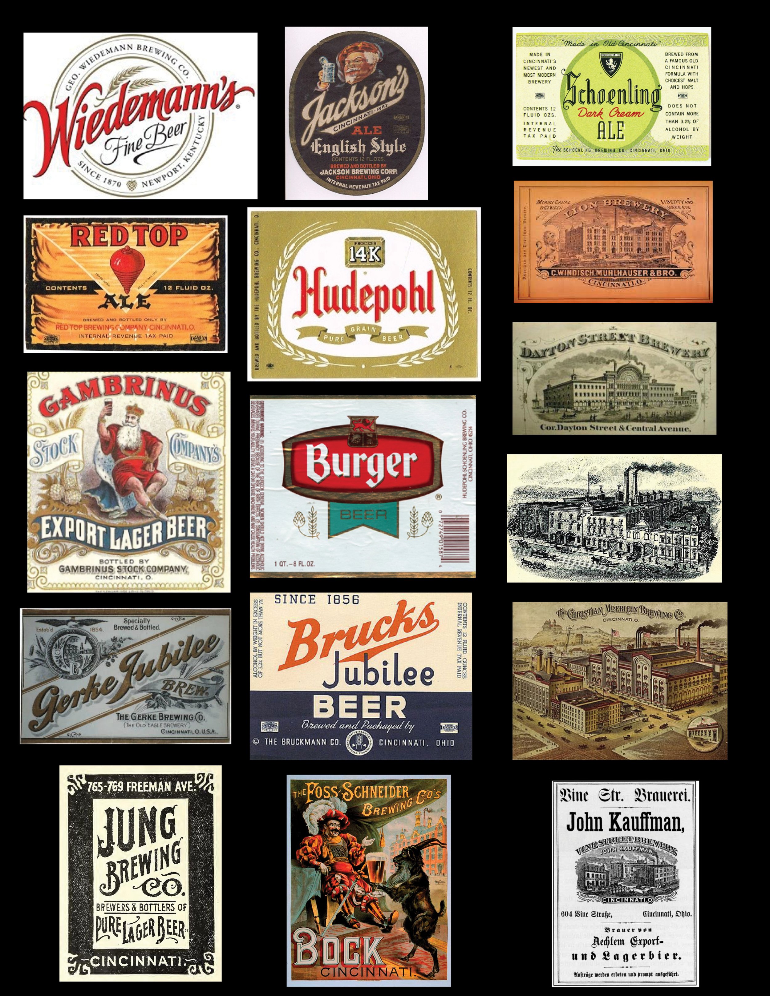
Some of the more popular breweries had immense neon lights on top of their brick warehouses and German Gothic fonts would blaze neon red or yellow in the night, reflected in the river or bouncing off the low-hanging winter skies of the Ohio River Valley. Their retinal impression remained with me and proved to be really handy when it came to studying illuminated manuscripts in my art history courses. By the time I had finished 30 hours of classes in manuscripts, I never wanted to see a Gothik font again in my life. Little did I know that the thrasher metal bands would revive the font’s popularity.

WHEN AUBREY MET PETER
My visual addiction deepened in high school. A classmate turned me on to the work of Aubrey Beardsley, a 19th British illustrator whose work focused on the grotesque, the decadent and the erotic, an irresistible combination for a closeted gay kid in the middle of the worst of teenage angst. The fact that Beardsley died at age 25 of tuberculosis was the finishing touch of romanticism. I pored over his illustrations in a secreted library book, sure that my Catholic father would promptly condemn it and take away my library card which was my door to artistic exploration. Beardsley was, after all, a close friend of Oscar Wilde. And we ALL knew that he was “one of those.”
At the same time, Peter Max entered our home in the form of the now-iconic poster of Bob Dylan. My sisters were besotted with the poet-singer; my father, reared on Mozart and Puccini, would roll his eyes and leave the room whenever that “hillbilly would start his whining.” Criticism notwithstanding, I sought out every bit of Maxiana I could lay my hands on. He seemed to me an updated, although less skillful version of Beardsley. My fascination with Peter Max found its apogee when Yellow Submarine was released. I saw it three times, twice by sneaking in when the box office agent was flirting with her boyfriend in the ticket booth.
For months I tried to reproduce both artists on my drawing pad, now lost to the passage of time. But the die was cast, the fix was in and I was well and truly an addict. An addict, I remain.

HAVE CAMERA, WILL CLICK. AND CLICK. AND CLICK.
Travel feeds my addiction: my enabler is Leica. And Canon. And Ricoh GR. And iPhone. My compulsion says “see, and you shall shoot.” Consequently, my photos clog the innards of three 2TB portable drives. I fool myself that I will go back and do a major purge someday, but the addict in me whispers, “not so fast, dude, there’s some design nuggets in there. You know there are.” And so, I add more pixels to the pile with every trip.
That’s not to say that I don’t use my photos in my graphic work. I am a huge fan of travel posters from the 1920’s through the 1970’s and my coffee table groans under the weight of poster art books. Over the years, I have created a series of posters based on my photographic forays.
THE ADDICTION THAT KEEPS ON GIVING
So, where will it all end, this visual addiction? Without being too Aubrey Beardsley about it, my final fix will probably be to design a graphic for the urn that will hold my ashes. But until that hopefully far-off day, I will feed my need for a fix and keep my eyes open for the next hit.

THE STREET, STRAIGHT UP
It all begins with an idea.
My art history studies at The Ohio State University did not include much about art after 1720. So, when my interest in art rekindled in the middle of my corporate career, I naturally started seeking out art that wasn’t limited to the 18th century or earlier. Sure, I was familiar with Impressionism and its successors: you could hardly avoid seeing all those Monet calendars and Picasso coffee cups that flooded the market in the 1980’s. But modern art, defined roughly by having been produced after 1945, this was a huge challenge for me. Like a lot of other folks, I felt awkward and suspicious around a lot modern art. I felt I was stupid because I wasn’t “getting it” and sometime suspected that the bit of blobs on the wall or a pile of rocks on a museum floor was some sort of con cooked up by cynical art dealers and a complicit art press to sell talentless art.
A year of intensive education in the Palm Springs Art Museum’s superlative docent training program last year cured me of that kind of thinking. No doubt, there are cynical art dealers and I still see art objects that make me roll my eyes, but my awareness shifted. Seismically.
SPRAY SOLDIERS
This wasn’t my first aesthetic recalibration. Like most business commuters in San Francisco, I had gotten resigned to seeing graffiti “deface” the trains and buses and pretty much every public place lacking a security guard. I tried really hard to suspend my midwestern, middle class prejudices since, after all, graffiti has a long history: the Romans were famous for juicy tagging that elicit a snicker even now. And it became clear that the hard line between graffiti and murals/social justice art had been dissolving for a couple of decades, especially in the Mission District and SOMA.
The notion of street art as “defacing” was debunked for good after my husband and I took a street art tour in Rome. Giorgio and Paolo (pictured below (guess who was the guide and who was the artist) ) weren’t just street artists, they were Apostles spreading the Good News along with the Spray Paint: “this is our art and our art is important. This art is our mirror to the world who doesn’t give a s--- about anything but consuming the earth. This art is our voice and our outrage and our humor. Look. And then f--- off if you don’t like it or “get” it.
I got it. Then over the next half-decade, I got it, repeatedly, in Barcelona and Berlin and Belfast and Berkeley. And brought it back to Palm Springs and to my graphic design thinking.


Oh, no doubt there is some street art that still lies in the creative trough called vandalism. But, increasingly, the art is become more and more sophisticated, and inevitably, art dealers and critics are piling on and monetizing what once the provenance of the outraged. And so it goes. But in this case – and to return to the manifesto in my first blog - today’s street art sure the hell ain’t boring.
SPRAY, WHAT?
So, how does street art (tagging, writing, wildstyle, rolling, bombing, etc.) relate to a graphic design practice? First, all street art is inherently graphic, whether it be stickers, spray paint, Sharpies, objects affixed to walls or stencils. It grabs your eyeballs and if good, grabs your balls of complacency and gives them a good squeeze. It can unsettle, enrage, or make you laugh. Most importantly, it makes you look closer and spend some real time: the holy grail of any graphic designer.
Second, street art usually relies on bright colors. Their colors change with the light and a dark alley can suddenly be infused with color when the sun strikes it or can magically appear under street lights.
Third, it can be referential and acquisitive, lifting ideas and artistic tropes from previous or current times. This is especially true in street art and graphics that reflect indigenous cultures, whether New York or Mexico City. In speaking with many street artists, I was told that they started with tagging, the ubiquitous assertions of identity that we normally refer to as graffiti. As they develop their style, their work can get increasingly more complex and technically adept. Many artists end up seeking more formal art training. And it shows in the sheer artistry of some of the work.
In response, cities and individual businesses are increasingly commissioning street art for larger installations or even for advertising. For instance, those metal roll-down doors that shop owners deploy at night are favorite targets for tagging. Smartly, the property owners now have street artists create a work that brings attention to their store. Pretty damn shrewd and a win for the owner, the artist, and the pedestrian.
One of the most astonishing street art installations is on the monumental embankment along the Tiber River in Rome. William Kentridge, a South African artist, was commissioned by the City of Rome to create the piece that runs 500 yards along the bank. What is so remarkable about this piece is its technique. Huge stencils were attached to the sooty walls of the embankment. He then pressure washed the exposed parts to uncover the original color of the stone. Over time, the figures will disappear as air pollution and the elements darken the stone once again.
In an interview about the decade-long effort fraught with bureaucratic delays, Kentridge said, “the Tiber is a river swollen with glory and pain. On one side the fortune of the popes, on the other the suffering of the Jewish Ghetto. Above ... a pulsating, splendid city; below, under the bridges, the desperation of the homeless…It is bit like putting a stethoscope on the banks of the Tiber and listening to the city tell its story.”
TELLING THE STORY
Whether it is graphic design in Palm Springs or street art in Rome, what grabs the attention is the story. A story can be as fleeting and subliminal as the Apple icon with its suggestive bite, to the pantheon of history represented in Kentridge’s work.
Sometimes a story isn’t a necessarily a narrative, it can be the story of moment in time. Take a look at Soviet or Communist Chinese propaganda posters. Heroic, inspirational, and by today’s standards, totally kitschy. But, boring, hell no!
STEPPING OUT AND UP
These blogs and my graphic design are all about stepping it out and stepping it up. I haven’t a frickin’ clue where my visual addiction will take me or what my increasing exposure to new ideas will result in, whether originating from textiles from Africa or street art are Albuquerque. But, I am sticking to my original mantra of this effort– No Mo Boring!